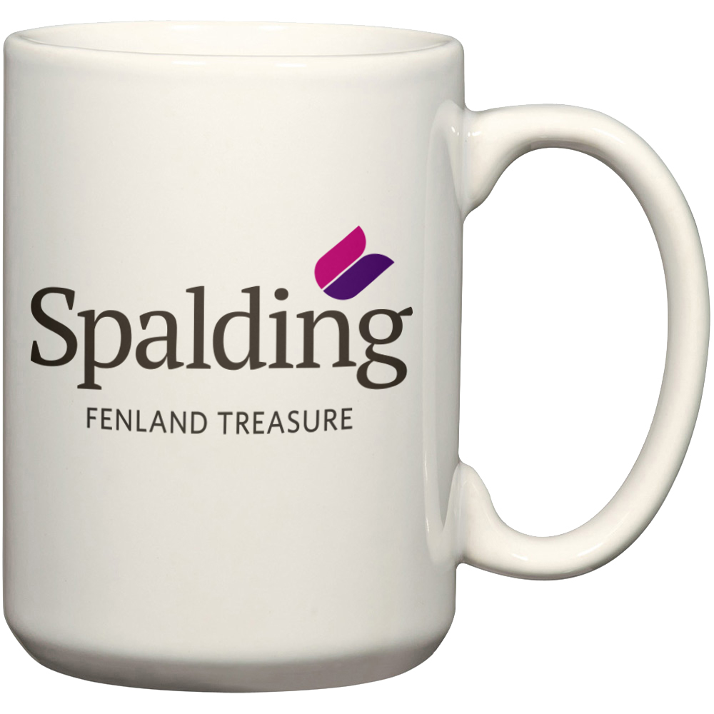
The design of Spalding’s new logo has been given a largely frosty reception.
Whilst there has been support for it, the majority of comments have labelled it “uninspiring”, “boring” and “awful”.
Emma Spridgen wrote on our Facebook page: “Sorry to say I think it’s truly terrible. Awful font and terrible old fashioned stylised tulip, looks like clip art. Would love to see the area flourish so good luck with the treasure theme.”
Taz Thornton posted: “Trouble is, design’s subjective, so you’ll never please everyone.”
 Spalding Town Forum chairman Coun George Aley says he doesn’t like the logo, but thinks “Fenland treasure” is “good”. But not everyone was keen on that tagline.
Spalding district councillor Gary Taylor – portfolio holder for communications – tweeted: “I don’t think the Fenland word was the best choice.”
And Anthony Robert Neave Smith posted: “Is it me? Spalding is in South Holland, Lincolnshire – Fenland is part of Cambridgeshire…”
The design by professional graphic designer and former Spaldonian Graham Taylor won a Town Centre Management Board competition.
Town centre manager Dennis Hannant said: “The judging committee chose this design as the winner from the 20 submissions received. Had more people made the effort and entered the competition, this logo may not have won.
“However, having said that, the committee stand by their decision and believe it is an excellent logo which represents the town’s history (the tulip), but with a modern twist, that can be used in many different situations, which the photographs clearly show.”
- See Mr Hannant’s full reply by clicking: Letters
